Evoca
Client
Evoca Group
Date
2018
The Brief
Realize the new visual identity of N & W, a leading company in the distribution of professional coffee machines, and create a new name to embody the values and the future growth of the brand.
Solution
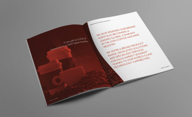
A new international branding strategy, aimed at strengthening the position of the leading company, in the Ho.Re.Ca and OCS sectors. The new “Evoca” brand identity aims to reflect tradition, the continuous pursuit of excellence, the technological and innovation capacity that are part of the Group’s history.
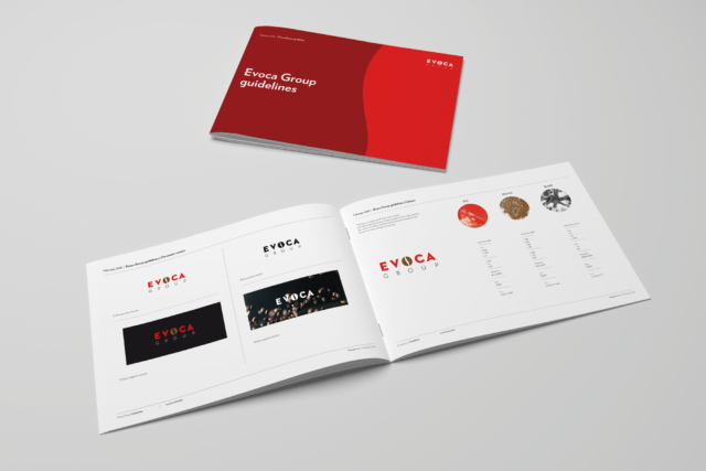
The identity, the naming and the visual concept have been designed to express the company’s strong connection with coffee, through the vectors of modernity and flexibility in use.
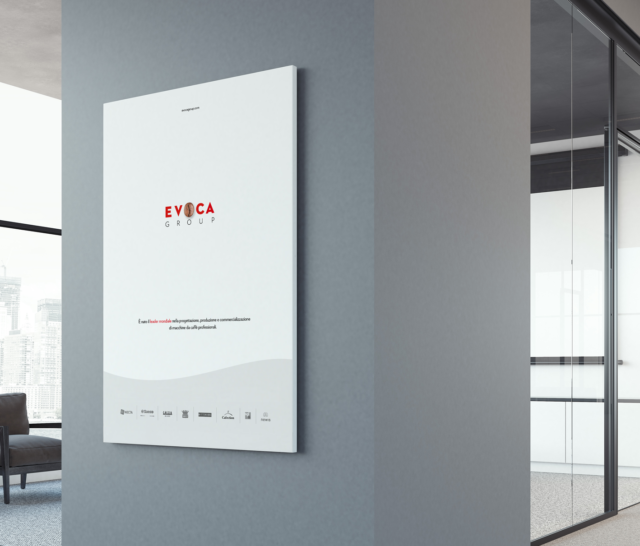
The symbol of the coffee bean is placed at the center of the word Evoca in order to create a visual balance between the two words that represents the synthesis between “evo” (evolution) and “ca” (coffee).
The wavy shapes used for the construction of the coffee bean have been used in the visual concept as a distinctive graphic element.
The new name was a fundamental step to express the positioning of the brand in an effective but simple way, and to leverage “coffee” in order to contextualize the offer of the Evoca brand.
