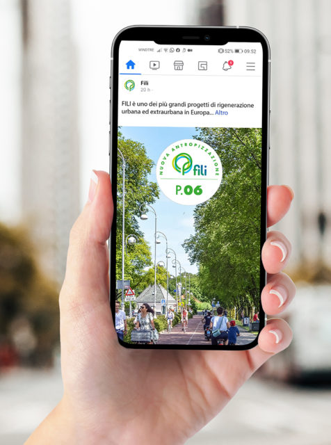
FILI
CLIENT
FILI
DATE
2021
THE BRIEF
Ideation of the naming and the visual identity for the new urban and extra-urban redeveloping project, dedicated to the creation of a great arterial road of sustainable mobility and high livability on the Milan-Malpensa axis. The project was wanted by FNM Group with Regione Lombardia, FERROVIENORD and Trenord.
THE SOLUTION
We designed a strong identity for a pioneering project in terms of applied technology, architecture, urban planning and mobility, thanks to a system of simple but memorable signs, able to last over time because synthesis of long-lasting values, shared by the community to which it refers. We defined a dynamic design system usable on different devices, digital and not, in order to create a sense of belonging.
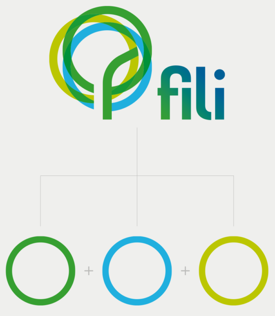
Claes Thure Oldenburg’s sculpture, the icon of Milano Cadorna Station, is ideally taken to give the name to a project that makes the urban reconnection and regeneration of the territory its founding value. FILI speaks a plural language, the union and interweaving of several singularities, of places that were previously distinct and are now reconnected, renewed.
The symbol is designed with a structure of three intertwined and connected rings that represent the souls of the project. The initial of the name FILI constitutes the supporting trunk of an imaginary tree.
Given the plural and aggregated nature of the FILI brand, we established side-by-side rules for co-branding.
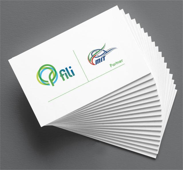
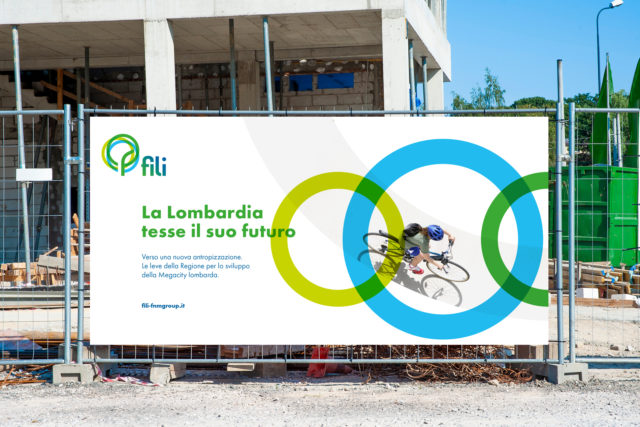
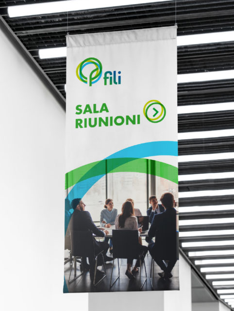
The brand’s circles are intertwined but modular, lending themselves to the definition of an adaptable identity language across different formats and communication materials.
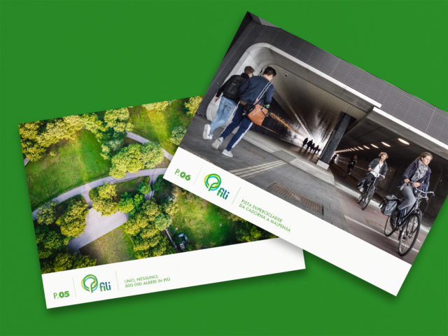
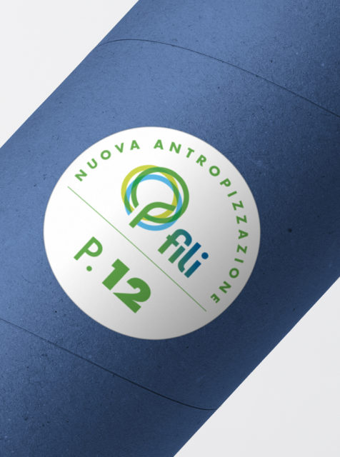
In order to catalogue the different involvements in the FILI project and allowing their esteem, we created a numbering system. This will allow to communicate in a unique and consistent way all the experiences that FILI will be able to attract.
