STARTT
CLIENT
STARTT
DATE
2021
CREDITS
Website development: Paperplane factory
THE BRIEF
STARTT is an interdisciplinary studio of architecture and urban transformation. In more than ten years STARTT emerged as a mature, innovative project with a consolidated own method. STARTT applies an anthropological-cultural approach to architectural and landscape design, and it merges different worlds so that the humanistic vision governs systemic functionality.
As a result, STARTT needed to have a brand capable of telling its new positioning.
THE SOLUTION
We created for STARTT a new brand design that combines past and future, a synthetic and legible logo with a primary purpose: to sign, to brand, to mark. The fonts choice gives the logo solidity, both from an aesthetic and a symbolic point of view: Futura PT Bold font has been created by Paul Renner in collaboration with one of his students; it has its own story in the History of Architecture, since its public presentation in 1933 on the occasion of the 5th Milan Triennale.
The wide spacing between the letters gives great distinctiveness and conveys a sense of openness and scalability. The central syllable is designed to accommodate chromatic and treatment variants, giving life to new semantic games. From the new brand, STARTT’s visual language has been developed and applied offline, to traditional tools of the design architect’s profession, as well as in the online communication starting from the website.
The new brand has been developed as a logotype. The aesthetic composition has been optimized in order to give distinctiveness and objectivity: the weight of the font has been calibrated to convey solidity, robustness, consolidation. The distance between letters has been increased to give a sense of openness and to communicate scalability, the possibility of being broke through in the central verbal component and consequently communicate inclusiveness and freshness without loss of balance.
The stationary has been developed playing on the combination of black and white, special papers and prints, square and rectangular formats.

The design includes a “top line” for projects of particular value, and everyday tools for professionals: from folders to labels, from A3 envelopes to large folders.


Among the all products useful in the relation with the client, the portfolio was designed as a responsive tool: it is conceived as a digital and/or a paper product, is dynamic, modular and scalable, translating the STARTT method in a concrete form.


“Our goal is to improve the relationship between people and places, making perceptible the value of the heritage of a specific territory, both material and immaterial, historical and human”.

The website has been designed as a work tool: the news are updated with the activities in progress, the images have great visibility in order to exhibit iconographic references and technical data of the project. STARTT team is composed by three partners and a network of collaborators, supporting the method, that is the distinctive soul of the studio.

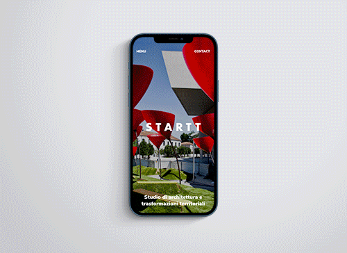
In continuity with the concept of “scalability”, proper of the STARTT method, the mobile version of the website was also designed to give importance the projects through images, keeping solid the attention of the user and the criteria of accessibility and usability.
