Ago
CLIENT
Fondazione Cassa di Risparmio di Modena
DATE
November 2018
CREDITS
Comune di Modena
Galleria Estensi
Università di Modena e Reggio Emilia
THE BRIEF
Ago is a diminutive of Augustine: the name is based on the coexistence of an “A” (the principle, but also “antropos”, “man”) and of “go”, the English translation of going that leads to the concept of change and evolution.
The brief consisted in the creation of a brand capable of expressing and reflecting the new cultural pole mission of international aspiration, as well as a brand being able to position the pole in a distinctive way compared to other European examples of the same level.
Ago – Modena Fabbriche Culturali will represent the union of humanistic and scientific culture, exploring new forms of dialogue and creating new narratives with the aim of attracting companies interested in measuring themselves with new digital languages.
The visual identity of Ago should therefore be able to enhance the historical heritage and, at the same time, to highlight the innovative, experimental and laboratory character of the Pole, thus reinforcing the interest of both local and international public.
SOLUTION
CeU has worked on a visual language to develop new narratives and new models of identity use, creating a syntax that can be declinedeternally.
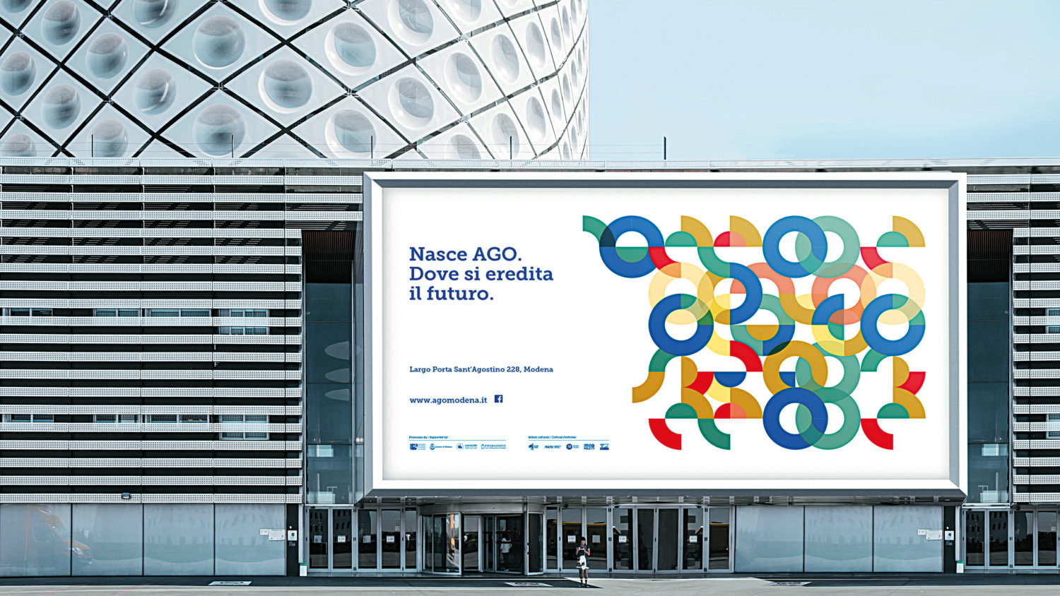
Simple signs, such as the circle or the stroke, are recognizable, declinable, generative and correspond to a synthesis between past and present, between cultural heritage and contemporaneity, between singular and multiplier.
The verbalization of the brand was created by working on two lines.
On the one hand, working on the oxymoron “future legacy” has generated a copy head evoking a space for meeting and generational exchange, on the other hand the concept of “wonder and magnificence” as the quality of the anthropos led to copy heads able to stimulate feelings of participation in young people.

Project steps
We participate at the call for tender for the new brand of the nascent cultural center of Modena, named AGO with Pay off MODENA CULTURAL FACTORIES. We analyzed the documentation integrating it with strategic research that explores the dynamics of the sector in terms of branding and communication, the best practices of national and international reference, and identified the expressive and evolutionary potential of the project.
Maintaining the history of humanity in relation to evolution, modernity, scientific culture and the human sciences, we have developed two proposals that, although in diversity, address an international, intercultural and intergenerational public.


The proposal that has been chosen is built from simple signs, like the circle, put into a system to generate visual languages that lend themselves to new narratives and new models of use of identity, as in a graphic game infinitely declinable, which alternately amplifies the institutional or popular character of the project syntax.


This language was recognized as strategic for the opening-event of the site, giving way to the second phase of the project where the communication strategy itself was central, aimed at creating interest, clarity, sense of belonging and desire in the user.

The brand identity references were the protagonists of the campaign in order to approach the event. It included public billboards, local and international press tabs, Facebook page construction and social management but the brand was unveiled only on the evening of the inauguration of the construction site-event.


At the same time, we started and concluded the third phase of the project that corresponds to the design and production of useful elements for conveying harmoniously and coordinated images of AGO Modena Fabbriche Culturali through online and off-line products, models and renderings.