Italian Council
THE BRIEF
To design the visual identity for the Italian Council, which was born with the explicit goal of promoting the production, knowledge and distribution of contemporary Italian creativity in the field of visual arts.
SOLUTION
To create a wordmark from the construction of simple geometric modules, which can be combined in infinite ways to always give new alphanumeric combinations, recognizable by the colours of the Italian identity.
Italian Council: a mark for Italian art worldwide
The visual identity for Italian Council begins from the Artistotle’s assumption that the whole is major than the sums of its parts; where Union isn’t neither homologation nor closure, but opening to the world, to contaminations, to dialogue, too exchange.
From the union of different parts comes the strength of Italy, unique in the world for taste, culture, art, design, cuisine, fashion and architecture. The visual identity designed for Italian Council means to unite different signs to draw a new form of collaboration based upon italianity to create a new portrait of art open to the world.
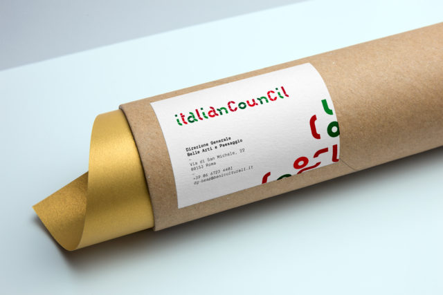
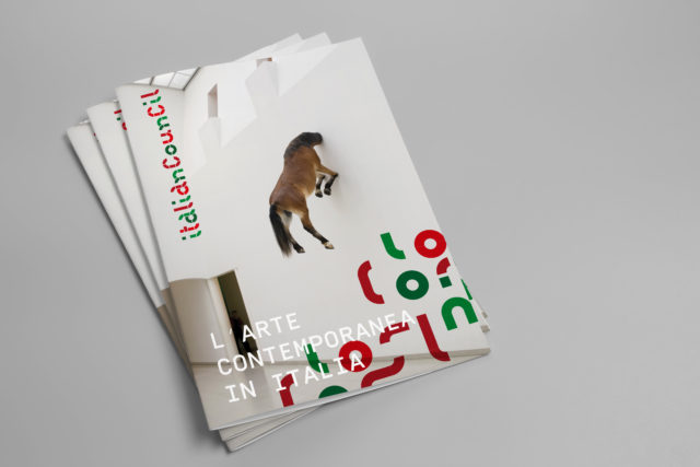
THE ART IS OVERLAPPED, CRUSHED, MODELED, INNOVA, IT WORKS ALWAYS COMBINING PARTIES THAT DESIGN NEW SETS.
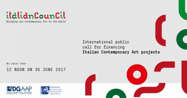
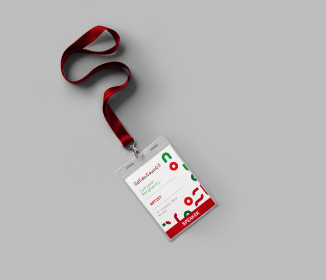
Similar but different elements, united and divided, overlapped and interlocked, interchangeable. Traits, lines, curves, modules that if composed can decline an alphabet, a logotype, a geographical indication.