MOLTO
CLIENT
Caltagirone Editore
DATE
2020
CREDITS
Q10 Media
Studio Sergio Juan
THE BRIEF
Caltagirone Editore needed to define the identity elements of an editorial Brand for new magazines attached to their newspapers. A Name and a Visual system were required for the magazine, its declinations and digital applications. An adaptive graphic design project, open to the web, to the application for events, webinair, video content and apps.
THE SOLUTION
Carmi e Ubertis has identified a proper visual language to develop new narratives and models of identity use, creating a syntax that is infinitely declinable, projected to precisely adhere to different needs. This language maintains the main points of AIRC’s institutional graphics, emphasizing the linearity and structure of the existing design, in continuity with the historical past of the visual identity including new elements to optimize communication.
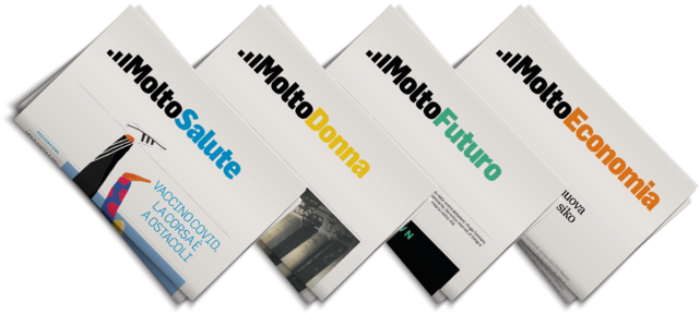
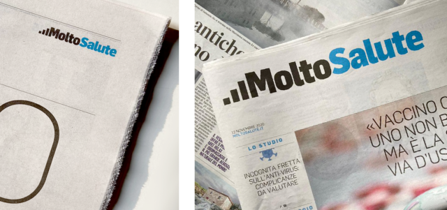
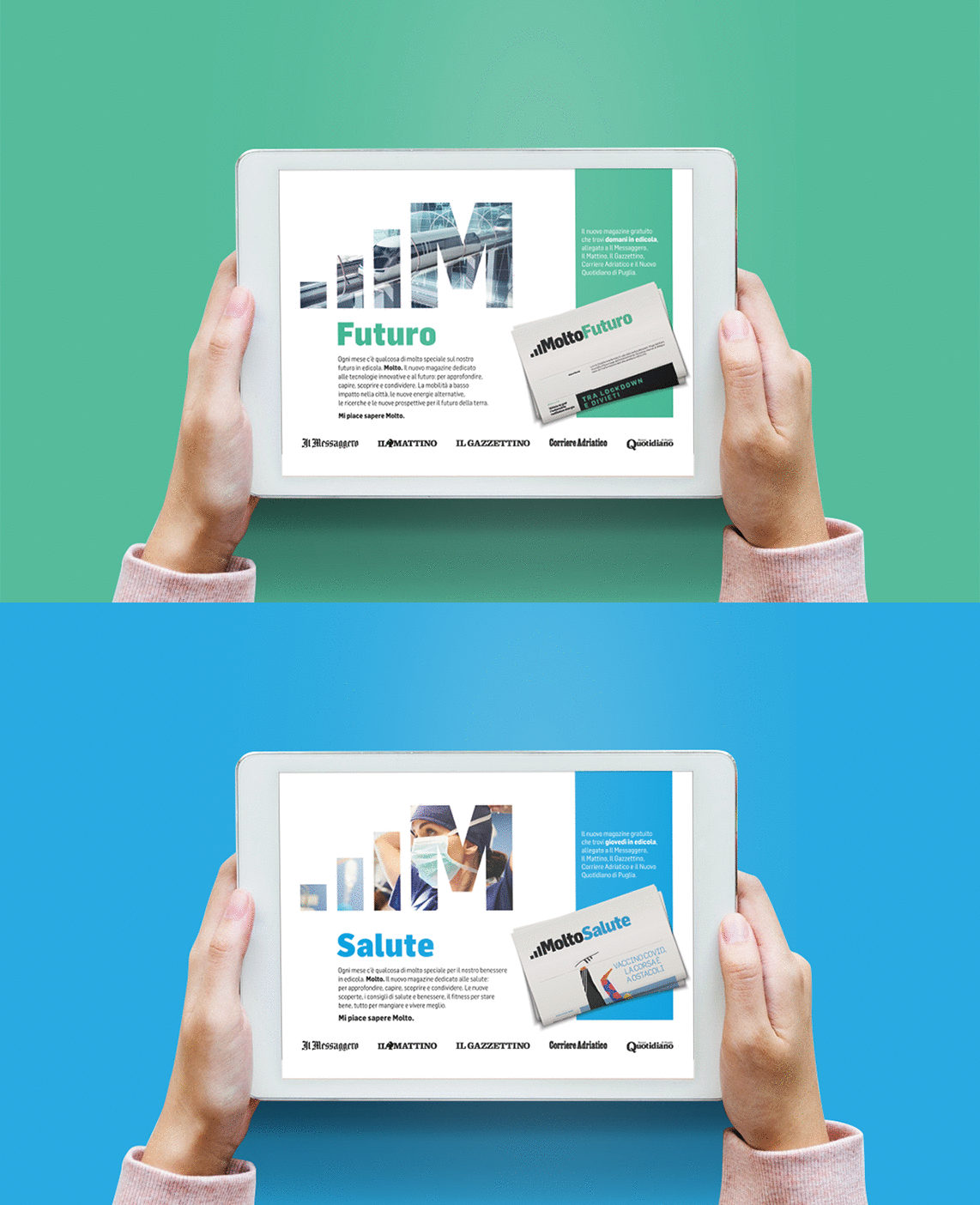
The Master Brand is generated by the union of the iconic element that represents growth with the initial of the magazine name, where the capital M becomes a distinctive element. This can, from time to time, live with a solid line or a mask in which put images. It can also be a sign of easy reduction. Alongside the project, the font family chosen is Flama.

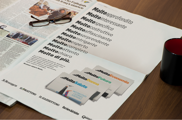
In continuity with the identified brand values, the launch campaign was conveyed on the publisher’s newspapers, paper and website, and on radio and social media. The creative concept emphasizes “Molto”, repeating it and reinforcing the promise.
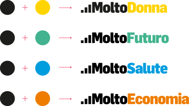
The declination of the sub brands acts on the name and chromatic denotation, making the system recognizable and maintaining its singularity.
