Quickdry Frame
CLIENTE
Quickdry Frame
DATE
2021
CREDITS
Website development: Paperplane Factory
THE BRIEF
A new patented technology highly performing, intended for the textile sector and particularly interesting for the production chains of outdoor clothing needs a naming, a visual identity, a technical drawing and a website.
THE SOLUTION
After the positioning analysis, we worked on the naming: we chose to name the technology “Quickdry Frame” and then, we designed its visual identity. The brand identity is mainly lettering, where the initial “Q” has been made into a “sign”: an open hexagon from which a light blue drop is ejected, as to evoke the structural component of the technology itself. The font is drawn, highly distinctive and positioned in the sport and technology area.
The “Q” is designed to recall the functional hexagonal lattice of Quickdry FrameTM. The tail of “Q” has been replaced by a drop to suggest the activity of ejection of the liquid particles.


The whole language of Quickdry Frame recalls performance, sportiveness and technological innovation.

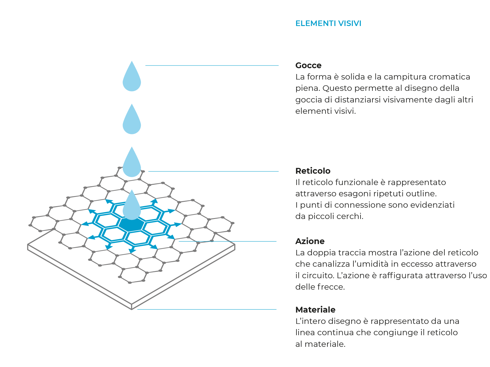
The technical design uses a synthetic and simple language, in order to explain in a concise manner the mechanism of operation of Quickdry FrameTM technology.

The website is addressed to two targets: the customer who intends to purchase the technology in order to improve his items and products, and the final user who has purchased the product of an company which use the Quickdry Frame Technology.
The website presents the new patent through multimedia contents, explains the quality of the technology, the certifications obtained, specifies the power applications and suggest people to get in touch with the company.
