Casalone Viticoltori
CLIENT
Casalone Viticoltori
DATE
2018
BRIEF:
Casalone winery needed to build a system of recognizability for its lines of wines, anchored to the great tradition of the area.
SOLUZIONE:
It’s been developed a Brand Design Language which is born from the relation between the human being and the land, from the rows of wines that mark the surfaces of the hills.
The human being, working the land with love for centuries, has built singular landscapes. These have been the natural inspiration for the research of a visual identity language for the product and its territory.


Nine lines, symbol of nine generations of winemakers, define the distinctive signs of the Brand Design Language for Casalone.
Each grape variety is identified through its own colour. The craftsmanship of the winemaking tradition is reflected to the graphic designed.

Gold: colour of sun, of light, of divine. It’s used to describe the richness and the preciousness.


In honour of excellent wine varieties, two Special Editions are born. The first gives value to the black pinot Arnest, the second one celebrates Monferrato e the selection Grignolino in purity, by adopting the great painting of Pier Francesco Guala, I canonici di Lu, as the symbol of an ancient tradition of conviviality.


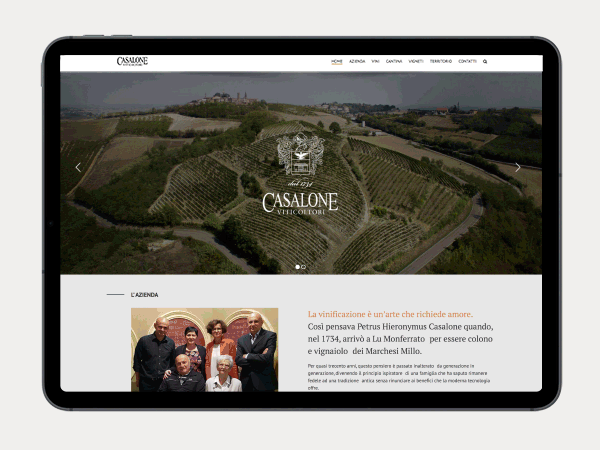
The new website of Casalone has been realized to answer to the contemporary needs of user experience and user interaction, maintaining a look&feel which is able to comunicate a centuries-old history and in continuity with the adopted Brand Design Language.
The pages of wines selection has been designed with their related data sheets and the possibility of purchase.