ATIT
CLIENT
Associazione Teatri Italiani di Tradizione
DATE
July 2019
THE BRIEF
To design the new identity of ATIT Associazione Teatri Italiani di Tradizione.The Association put together theaters defined “traditional” by the national legislation, that is, those that produce and disseminate the Lyric Opera and multidisciplinary shows, music, prose, concerts. They are deeply rooted into territories, virtuous because their income contributes to covering their budget. They are a breeding ground for workers, permanent training places, cultural and social instruments.
THE SOLUTION
The strategic document outlined as the pillars of the new Brand Identity the relationship with its local community and the institutional positioning of ATIT, which unites different theaters. The visual identity was therefore conceived for very different applications: from institutional co-branding capable of strengthening, supporting and improving the relationship between theaters, up to the communication of the Association life through all the existing vectors (stationary, publications, campaigns, adv, merchandising, images, static or moving, promotional of the theater or its season, online communication).
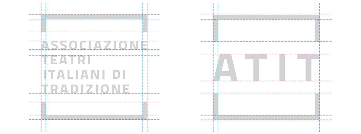
ATIT new visual identity borns from the idea of theater as an open place, a welcoming stage for meeting, discovery and recollection, as a place for social sharing, an indoor square, with a common yet unique architecture for each individual theater. Carmi e Ubertis has identified the affirmation of the existence of ATIT and the disclosure of its nature as a primary step, where in some cases it is the association that supports the theater, in other cases viceversa. This is why the logo is designed in an extended and contracted form. The first sees the initials ATIT in the center of a sign inscribed in a square, while the second contains the words Associazione Teatri Italiani di Tradizione. The versions were built as two expressions of a single logo, therefore they are entered in the same square, follow the same geometric composition, the same font.
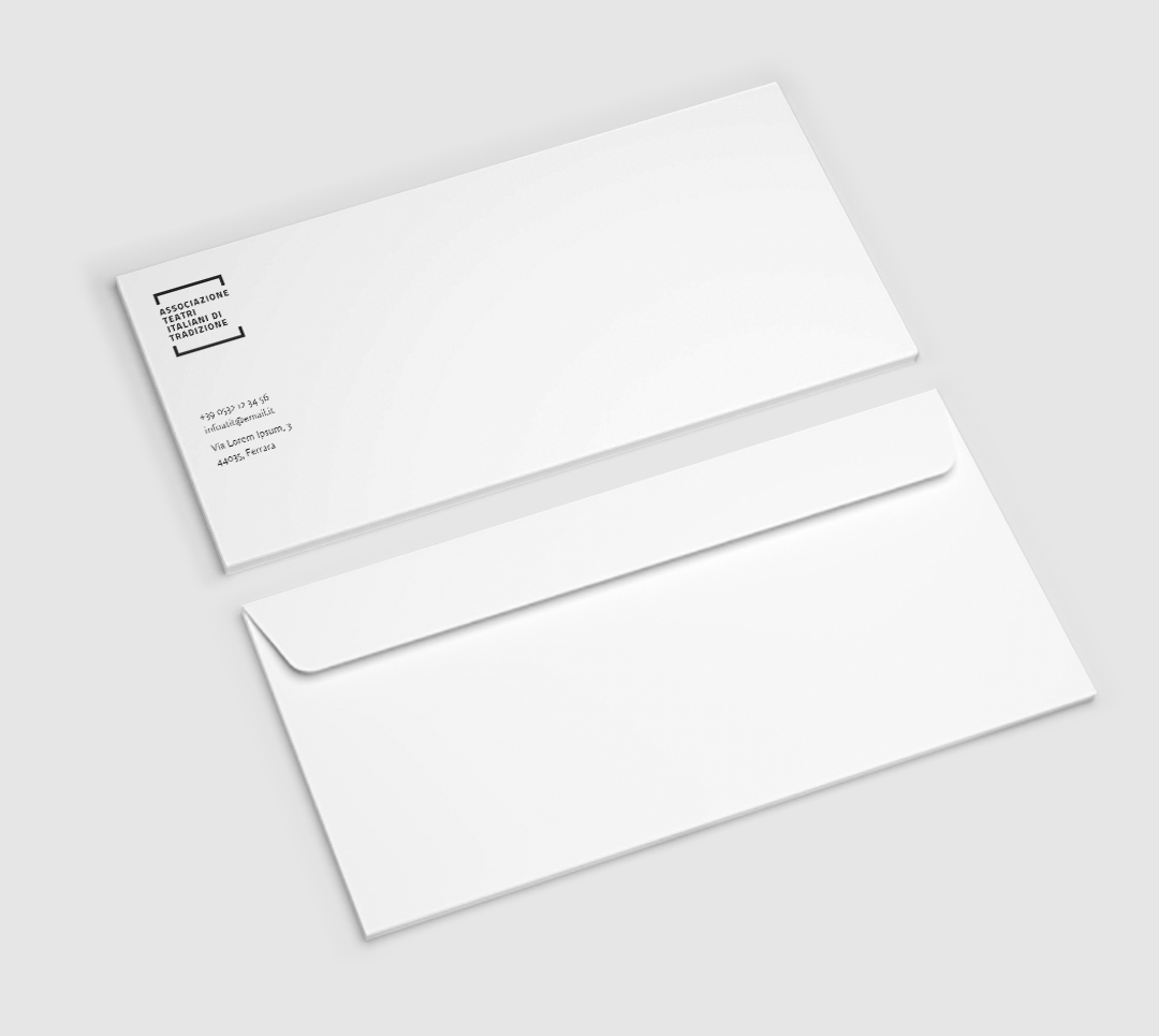
Stationary and merchandising demonstrate the expressive potential of the brand in terms of applied language. The logo contains a graphic sign generated by a square that can be easily declined in a “responsive” format, in an independent graphic element, in a sign that differentiates the contents, even in other proportions it maintains its own recognizability.


Language becomes an element of union between the various theaters, giving a uniform and harmonizing format. It is suitable for hosting different contents such as texts and photography. It accepts images from the classic register to a strongly contemporary style, single or composite, where the geometry of the sign governs the composition.


Every day
We open the curtain
On the cultural scene